
- 분류 전체보기 (1263)

- 클래스 (0)
- 여행 (51)
- 중국어 (22)
- 영어 (5)
- 수영 (4)
- IT (980)
- Java (320)
- Mobile (12)
- WebProgramming (2)
- Algorithm (9)
- HTML&CSS (108)
- Javascript (188)
- Python (24)
- Eclipse (16)
- VSCode (29)
- SpringBoot (101)
- DesignPattern (0)
- CSS (5)
- React (2)
- postgres (2)
- linux (4)
- maven (7)
- gradle (1)
- IntelliJ (41)
- Git (32)
- JUnit (50)
- lodash (1)
- jQuery (11)
- Docker (10)
- AWS (1)
- AI (1)
- MySQL (2)
- 재테크 (3)
- 생활의 발견 (58)
- 일상여행 (7)
- Review (27)
- 맛집 (6)
- Tools (83)
- TISTORY (15)
| 일 | 월 | 화 | 수 | 목 | 금 | 토 |
|---|---|---|---|---|---|---|
| 1 | 2 | 3 | 4 | |||
| 5 | 6 | 7 | 8 | 9 | 10 | 11 |
| 12 | 13 | 14 | 15 | 16 | 17 | 18 |
| 19 | 20 | 21 | 22 | 23 | 24 | 25 |
| 26 | 27 | 28 | 29 | 30 |
- junit
- Java
- 자바스크립트
- 자바
- list
- javascript
- Array
- input
- 자바문법
- js
- 문자열
- Eclipse
- math
- 스프링부트
- Visual Studio Code
- 테스트자동화
- vscode
- 정규식
- IntelliJ
- HashMap
- CSS
- ArrayList
- 배열
- 단위테스트
- 인텔리제이
- html
- junit5
- string
- SpringBoot
- java테스트
- Today
- Total
어제 오늘 내일
[HTML/CSS] 배경색 그라데이션 넣기 (linear-gradient()) 본문
지난번에는 단순하게 요소의 배경색을 지정하거나, 배경 이미지를 지정하는 방법을 알아보았습니다.
[HTML/CSS] div 안의 배경색 지정하기
div 안의 배경색을 지정하기 위해서는 css의 background-color 속성을 지정합니다. background-color 예제 div { height : 20px; width : 200px; } CSS에서 색깔을 지정하는 방법은 다음과 같습니다. 이름 16진..
hianna.tistory.com
[HTML/CSS] div에 배경 이미지 넣기 총정리 (반복, 한번만, 가운데, 꽉차게)
CSS를 사용하여 div에 배경 이미지를 넣는 방법입니다. 배경 이미지 넣기 (background-image) 배경 이미지 반복 횟수 지정하기 (background-repeat) background-repeat 속성 값 배경 이미지 반복 (repeat) 배경 이..
hianna.tistory.com
CSS를 이용하면, 단색의 배경색뿐만 아니라,
2가지 이상의 여러 가지 색깔을 조합하여 그라데이션 효과를 줄 수도 있습니다.
CSS로 그라데이션 효과를 줄 수 있는 함수는 다음과 같이 여러 가지가 있습니다.
- linear-gradient()
- radial-gradient()
- conic-gradient()
- repeating-linear-gradient()
- repeating-radial-gradient()
- repeating-conic-gradient()
여기서는 가장 유용하게 많이 사용되는 linear-gradient() 함수를 살펴보겠습니다.
목차
- linear-gradient()
- direction으로 그라데이션 방향 조정하기
- angle로 그라데이션 방향 조정하기
- 여러 색깔 그라데이션 만들기
- 그라데이션 색깔과 색깔 위치 지정하기
- 그라데이션 경계를 분명히 하기
1. linear-gradient()
linear-gradient()는 직선을 따라서 2개 이상의 색상 변화를 점진적으로 표현합니다.
background-image: linear-gradient ( direction|angle, color-stop1, color-stop2, .... );
background : linear-gradient (direction|angle, color-stop1, color-stop2, ... );
background-image, background
linear-gradient() 함수는,
색깔을 채우는 것이지만,
background-color 속성이 아닌 background-image 속성에 사용합니다.
단축 속성인 background에도 사용할 수 있습니다.
linear-gradient 파라미터
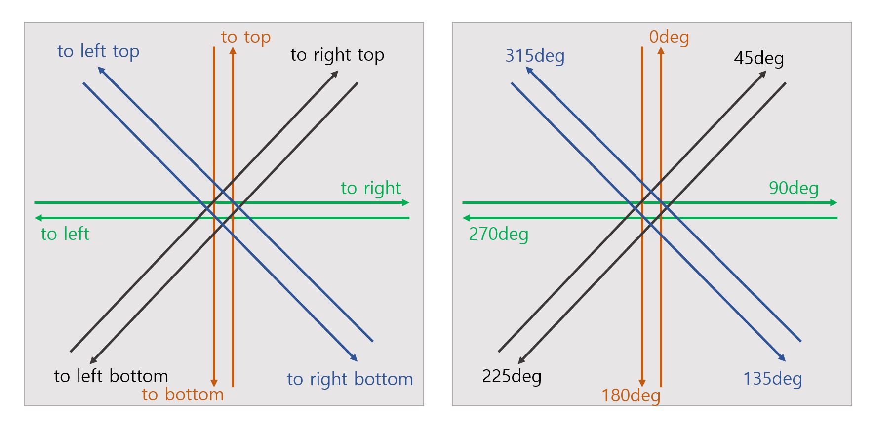
- direction 또는 angle
- 그라데이션이 일어나는 선의 방향입니다.
- direction과 angle, 이 두가지 방법으로 표현할 수 있습니다.
- direction
- 'to'로 시작합니다.
- left, right, top, bottom을 조합하여, 그라데이션 선의 방향을 지정합니다.
- to left, to right, to bottom, to top - 수평선과 수직선
ex) to left : 오른쪽에서 왼쪽으로 그라데이션 색상이 적용됩니다. - to left bottom, to left top, to right bottom, to right top - 대각선
(to 이후에 방향을 지시하는 키워드의 순서는 바뀌어도 상관 없습니다.
예를 들어, to left bottom와 to bottom left는 같습니다.)
ex) to left bottom : 오른쪽 상단에서, 왼쪽 바닥쪽으로 (대각선으로) 그라데이션 색상이 적용됩니다.
- angle (각도)
- 그라데이션 선의 방향 각도입니다.
- 0deg, 45deg, 90deg...와 같이, 숫자로 그라데이션 선의 방향을 지정할 수 있습니다.
- 0deg = to top
- 45deg = to right top
- 90deg = to right
- 135deg = to right bottom
- 180deg = to bottom
- 225deg = to left bottom
- 270deg = to left
- 315deg = to left top
- 각도가 커질 수록, 시계방향으로 선의 축이 이동합니다.
- direction을 사용하는 것보다 더 정교하게 방향을 지정할 수 있습니다.
- 이 값을 지정하지 않으면, 기본값은 to bottom (180deg) 입니다.
- color-stop
- 색깔과 색깔의 위치를 지정할 수 있습니다.
- 색깔 - 이름, RGB(A), HSL(A) 등
- 색깔의 위치) - %, px 등으로 표현합니다.
2. direction으로 그라데이션 방향 조정하기
my_linear_gradient.html
<!DOCTYPE html>
<html>

<head>
    <title>linear-gradient</title>
    <link rel="stylesheet" href="css/my_linear_gradient.css" />
</head>

<body>
    <div>
        <div class="outer_div">
            <div class="my_gradient_1"></div>
            <p>linear-gradient(to bottom, red, yellow)</p>
        </div>
        <div class="outer_div">
            <div class="my_gradient_2"></div>
            <p>linear-gradient(to top, red, yellow)</p>
        </div>
        <div class="outer_div">
            <div class="my_gradient_3"></div>
            <p>linear-gradient(to right, red, yellow)</p>
        </div>
        <div class="outer_div">
            <div class="my_gradient_4"></div>
            <p>linear-gradient(to left, red, yellow)</p>
        </div>
    </div>
    <div>
        <div class="outer_div">
            <div class="my_gradient_5"></div>
            <p>linear-gradient(to bottom right, red, yellow)</p>
        </div>
        <div class="outer_div">
            <div class="my_gradient_6"></div>
            <p>linear-gradient(to bottom left, red, yellow)</p>
        </div>
        <div class="outer_div">
            <div class="my_gradient_7"></div>
            <p>linear-gradient(to top right, red, yellow)</p>
        </div>
        <div class="outer_div">
            <div class="my_gradient_8"></div>
            <p>linear-gradient(to top left, red, yellow)</p>
        </div>
    </div>
</body>

</html>
my_linear_gradient.css
.my_gradient_1 {
    background-image: linear-gradient(to bottom, red, yellow);
    height: 200px;
}

.my_gradient_2 {
    background-image: linear-gradient(to top, red, yellow);
    height: 200px;
}

.my_gradient_3 {
    background-image: linear-gradient(to right, red, yellow);
    height: 200px;
}

.my_gradient_4 {
    background-image: linear-gradient(to left, red, yellow);
    height: 200px;
}

.my_gradient_5 {
    background-image: linear-gradient(to bottom right, red, yellow);
    height: 200px;
}

.my_gradient_6 {
    background-image: linear-gradient(to bottom left, red, yellow);
    height: 200px;
}

.my_gradient_7 {
    background-image: linear-gradient(to top right, red, yellow);
    height: 200px;
}

.my_gradient_8 {
    background-image: linear-gradient(to top left, red, yellow);
    height: 200px;
}

.outer_div {
    width: 400px;
    float: left;
    border: 1px solid;
}
결과

direction 이름을 사용해서 그라데이션을 만들었습니다.
linear-gradient(to bottom, red, yellow);
그라데이션 방향은 위에서 아래로 향합니다.
위에서부터 순서대로 div영역의 처음과 끝에 빨강, 노랑이 배치되고,
그 사이는 자연스럽게 그라데이션이 적용된 색이 보여집니다.
linear-gradient(to top left, red, yellow);
그라데이션 방향은 오른쪽 하단에서 왼쪽 상단입니다.
오른쪽 하단에는 빨강, 왼쪽 상단에는 노랑이 배치되고,
마찬가지로 그 사이는 자연스럽게 그라데이션 된 색이 보여집니다.
3. angle로 그라데이션 방향 조정하기
my_linear_gradient_angle.html
<!DOCTYPE html>
<html>

<head>
    <title>linear-gradient</title>
    <link rel="stylesheet" href="css/my_linear_gradient_angle.css" />
</head>

<body>
    <div>
        <div class="outer_div">
            <div class="my_gradient_1"></div>
            <p>linear-gradient(0deg, red, yellow)</p>
        </div>
        <div class="outer_div">
            <div class="my_gradient_2"></div>
            <p>linear-gradient(45deg, red, yellow)</p>
        </div>
        <div class="outer_div">
            <div class="my_gradient_3"></div>
            <p>linear-gradient(90deg, red, yellow)</p>
        </div>
        <div class="outer_div">
            <div class="my_gradient_4"></div>
            <p>linear-gradient(135deg, red, yellow)</p>
        </div>
        <div class="outer_div">
            <div class="my_gradient_5"></div>
            <p>linear-gradient(180deg, red, yellow)</p>
        </div>
        <div class="outer_div">
            <div class="my_gradient_6"></div>
            <p>linear-gradient(225deg, red, yellow)</p>
        </div>
        <div class="outer_div">
            <div class="my_gradient_7"></div>
            <p>linear-gradient(270deg, red, yellow)</p>
        </div>
        <div class="outer_div">
            <div class="my_gradient_8"></div>
            <p>linear-gradient(315deg, red, yellow)</p>
        </div>
    </div>
</body>

</html>
my_linear_gradient_angle.css
.my_gradient_1 {
    background-image: linear-gradient(0deg, red, yellow);
    height: 150px;
}

.my_gradient_2 {
    background-image: linear-gradient(45deg, red, yellow);
    height: 150px;
}

.my_gradient_3 {
    background-image: linear-gradient(90deg, red, yellow);
    height: 150px;
}

.my_gradient_4 {
    background-image: linear-gradient(135deg, red, yellow);
    height: 150px;
}

.my_gradient_5 {
    background-image: linear-gradient(180deg, red, yellow);
    height: 150px;
}

.my_gradient_6 {
    background-image: linear-gradient(225deg, red, yellow);
    height: 150px;
}

.my_gradient_7 {
    background-image: linear-gradient(270deg, red, yellow);
    height: 150px;
}

.my_gradient_8 {
    background-image: linear-gradient(315deg, red, yellow);
    height: 150px;
}

.outer_div {
    width: 400px;
    float: left;
    border: 1px solid;
}
결과

숫자 angle을 사용하여, 그라데이션을 생성하였습니다.
숫자를 사용하면, 더 정교하게 그라데이션 방향을 설정할 수 있습니다.
4. 여러 색깔 그라데이션 만들기
그라데이션 색깔을 여러개 지정할 수도 있습니다.
my_linear_gradient_colors.html
<!DOCTYPE html>
<html>

<head>
    <title>linear-gradient</title>
    <link rel="stylesheet" href="css/my_linear_gradient_colors.css" />
</head>

<body>
    <div>
        <div class="outer_div">
            <div class="my_gradient"></div>
            <p>linear-gradient(red, green, blue, gray)</p>
        </div>
    </div>
</body>

</html>
my_linear_gradient_colors.css
.my_gradient {
    background-image: linear-gradient(red, green, blue, gray);
    height: 150px;
}

.outer_div {
    width: 400px;
    float: left;
    border: 1px solid;
}
결과

linear-gradient(red, green, blue, gray);
그라데이션 시킬 여러가지 색을 순서대로 나열하여 파라미터로 넣어줄 수 있습니다.
5. 그라데이션 색깔과 색깔 위치 지정하기
my_linear_gradient_colorstop.html
<!DOCTYPE html>
<html>

<head>
    <title>linear-gradient</title>
    <link rel="stylesheet" href="css/my_linear_gradient_colorstop.css" />
</head>

<body>
    <div>
        <div class="outer_div">
            <div class="my_gradient_1"></div>
            <p>linear-gradient(to right, red, yellow)</p>
        </div>
        <div class="outer_div">
            <div class="my_gradient_2"></div>
            <p>linear-gradient(to right, red, yellow 10%)</p>
        </div>
    </div>
</body>

</html>
my_linear_gradient_colorstop.css
.my_gradient_1 {
    background-image: linear-gradient(to right, red, yellow);
    height: 150px;
}

.my_gradient_2 {
    background-image: linear-gradient(to right, red, yellow 10%);
    height: 150px;
}

.outer_div {
    width: 400px;
    float: left;
    border: 1px solid;
}
결과

linear-gradient(to right, red, yellow 10%);
이 그라데이션은 왼쪽부터 오른쪽 방향으로 생성됩니다. (to right)
색상 옆에 색깔의 위치를 지정할 수 있습니다.
yellow는 왼쪽부터 10% 지점에 노란색의 정점(position)을 위치시킵니다.
만약, 색깔의 위치를 지정해 주지 않으면, 자동으로 색깔의 위치가 계산되어 지정됩니다.
red는 시작 지점이 명시되어 있지 않지만, 아래 구문과 같은 의미입니다.
linear-gradient(to right, red 0%, yellow 10%);
0%로 지정된 정점(position)이 없으면, 첫 번째 컬러로 지정된 색의 정점의 위치가 0% 위치라고 할 수 있습니다.
이렇게 각 색의 위치가 정해지고,
각 색깔의 경계에 자연스럽게 그라데이션이 생성됩니다.
6. 그라데이션 경계를 분명히 하기
my_linear_gradient_solid.html
<!DOCTYPE html>
<html>

<head>
    <title>linear-gradient</title>
    <link rel="stylesheet" href="css/my_linear_gradient_solid.css" />
</head>

<body>
    <div>
        <div class="outer_div">
            <div class="my_gradient_1"></div>
            <p>linear-gradient(to right, red 33%, yellow 33%, yellow 66%, blue 66%)</p>
        </div>
        <div class="outer_div">
            <div class="my_gradient_2"></div>
            <p>linear-gradient(to right, red 33%, yellow 33% 66%, blue 66%)</p>
        </div>
    </div>
</body>

</html>
my_linear_gradient_solid.css
.my_gradient_1 {
    background-image: linear-gradient(to right, red 33%, yellow 33%, yellow 66%, blue 66%);
    height: 150px;
}

.my_gradient_2 {
    background-image: linear-gradient(to right, red 33%, yellow 33% 66%, blue 66%);
    height: 150px;
}

.outer_div {
    width: 600px;
    float: left;
    border: 1px solid;
}
결과
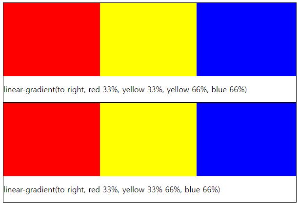
linear-gradient(to right, red 33%, yellow 33%, yellow 66%, blue 66%);
red의 정점은 33% 지점입니다.
yellow의 정점 또한 33% 지점입니다.
이렇게 설정하면, 두 색깔 간의 그라데이션이 생기기 어렵기 때문에
2가지 색깔간의 경계가 분명해집니다.
위 구문을 아래와 같은 방법으로 작성할 수도 있습니다.
linear-gradient(to right, red 33%, yellow 33% 66%, blue 66%);
'IT > HTML&CSS' 카테고리의 다른 글
| [HTML/CSS] 배경색 두개로 반반 나누어 지정하기 (0) | 2022.08.07 |
|---|---|
| [HTML/CSS] 무지개 그라데이션 (linear-gradient) (0) | 2022.08.06 |
| [HTML/CSS] 이미지 모서리 둥글게, 동그란 프로필 이미지 만들기 ( border-radius) (0) | 2022.08.04 |
| [HTML/CSS] 이미지 색상 반전 시키기 - invert() (0) | 2022.08.03 |
| [HTML/CSS] 이미지 흑백으로 변환하기 - grayscale() (0) | 2022.08.02 |


